
It is no secret to anyone that through the color shades you can change the perception of space. This successfully enjoy interior design professionals, creating their best projects for customers. In the material of this article, we will look at how to choose the color of the apron for the kitchen, indicating which criteria the selection of one or another shade is based.
Basic rules for selecting shades
Color solutions of kitchen apron can not be called random. Their choice is based on the records of various factors. For example, the key is the location of the windows. If they come out on the north side, use cold paints is categorically unacceptable. This will lead to the fact that the room will become gloomy and cold.
At the same time, for the kitchen, the windows of which go to the south, you can not pick up hot paints. From this it will be visually stuffy and uncomfortable. The exit: for cold rooms take warm tones, for warm - cold. This allows you to achieve a visual balance, which is extremely important for the interior of any dwelling room.
The color of the apron for the kitchen can be selected based on the following rules:
- It can be related primary color design either its contrast companion;
- It must contrast with the facades of mounted and floor cabinets;
- It can be a relative table top, accessories, dishes, curtains, flower-colored dining group;
- It cannot be knocked out on a general background, in which no more than 4 basic tones are allowed;
- Its approximate color should be repeated at least in an insignificant interior accessory;
- It must be pure, well-visible, devoid of acidity, which cuts the eyes;
- He should not visually reduce the space and make a negative perception;
- It must be beautiful and advantaged on the material chosen for apron with a certain texture.
How to choose?
When the question of choice turns into a problem, I want to resort to ready-made templates for which you can pick up a color without thinking about the combination of shades. And this opportunity is really there: to select harmonious contrasts you can contact a color circle. Harmoniously located shades in it are opposite each other. At the same time, those that are located on both sides of the opposite of the desired color of the shade are also considered successful for a combination.
Whatever color is chosen for the design of the kitchen, the tone of the apron should not interrupt it. Accent, the role of which is assigned apron, should stand out on a general background. But this is possible only if it is a bit. At the same time, it is impossible to forget the rule of color contrast: in the interior 1 color is considered to be dominant, the 2nd - its contrast, the 3rd and 4th bind the first two shades.
In this case, the colors of the second pair can be related two first. As for the color of the apron itself, it can be related to each of the 4 tones. However, if the chaos will be going on in his colors with the involvement of many shades of the color palette, it will make an imbalance into aesthetic and color perception of the kitchen interior. No need for anything superfluous - this is based on this or that color.
To understand what is suitable in a case, it is enough to look at the colors of the elements of the arrangement. For example, it can even be the upholstery of chairs, the color of their covers, sometimes even any minor item. If the wallpaper is already pasted in the kitchen, the floor is packaged, the furniture is selected, the curtains hang out, you will have to push out from this. An exception from the rules can only be allowed when the kitchen is made in neutral tones.
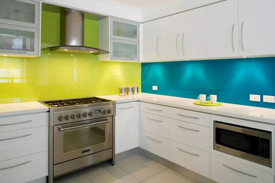
Such colors initially do not carry any emotional color. For this reason, they can be combined with color contrasts. White, gray, silver, metallic and even black combined with all colors of color palette. On their background, each color contrast will bring his notes to the interior. For example, green or pistachio will add lives, the cornflower is hinting for freshness.
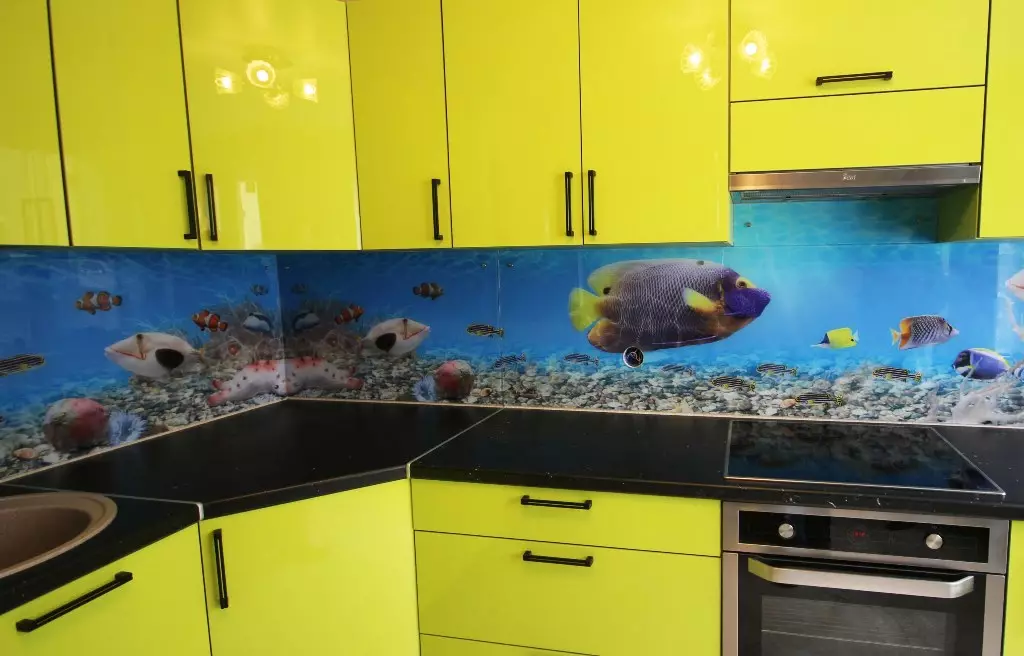
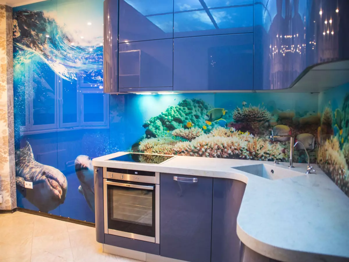
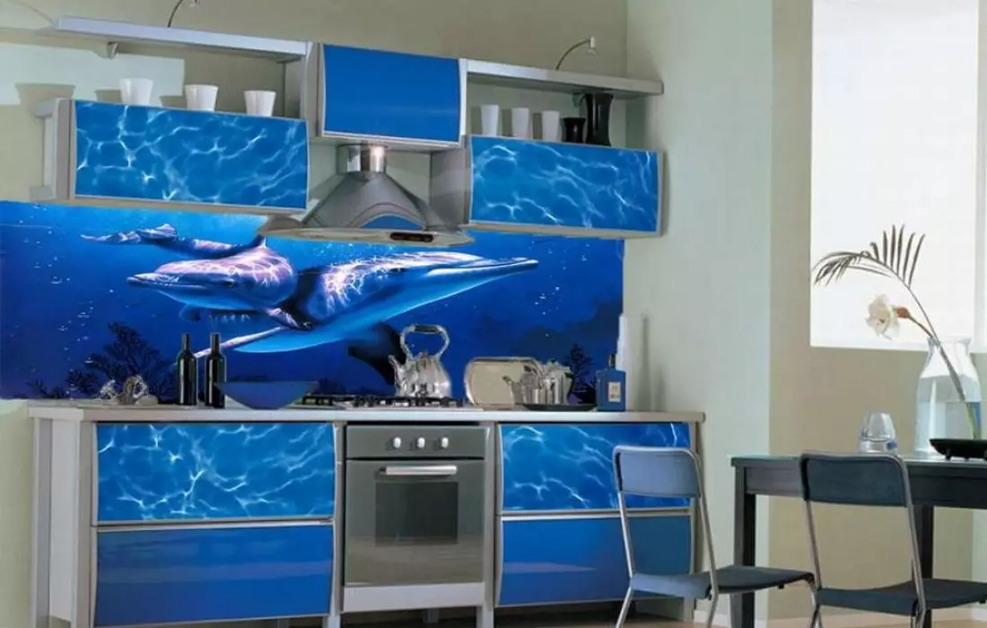
When choosing a color will have to take into account the theme of the apron, namely its drawing. Often it is chosen wrong, without thinking the degree of relevance in the kitchen room. Agree, Dolphins and other maritime livestock are not a place in the kitchen, like three-dimensional images from which the eyes are tired. Even if the color of the background is supercrace, it does not mean that the apron will look appropriate and expensive.
For bright kitchen
The color of the color of the apron for the kitchen in light colors is based on the aesthetic perception of the tones of this group. Unlike other colors of the palette, they are able to put the space of high status. Therefore, it will have to pick up the contrast thoroughly, because otherwise the interior can look very simple. We offer contrasts to which interior design professionals are resorted.
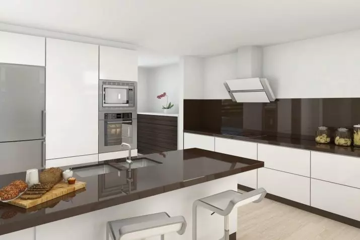
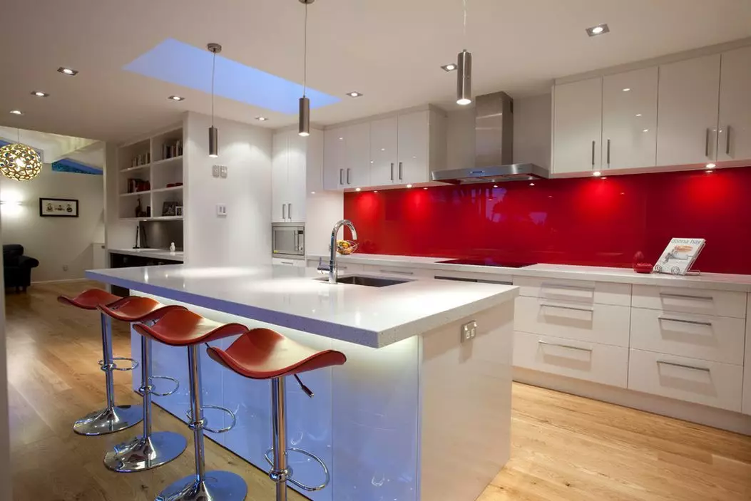
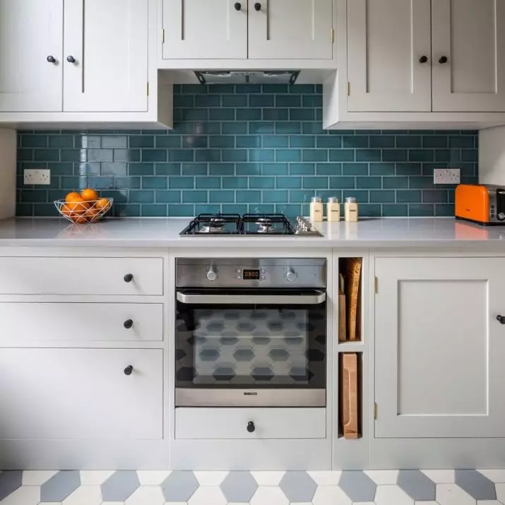
- In white kitchen The color of the kitchen apron can be blue, turquoise, black, wood, steel, gray-brown, lavender, purple, pistachio, lemon pink, coffee, mint, peach, chocolate, sandy.
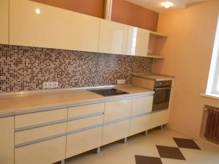
- For beige and gold Vanilla, white, coffee, peach, green, gray, coffee, peach, green, gray, and gray-chocolate, white and brown, white-chocolate, white-cherry, white-lilac palette, will go.
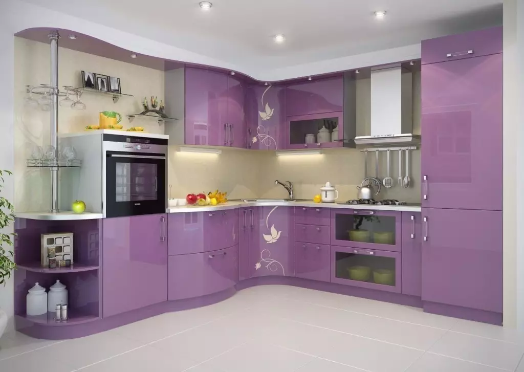
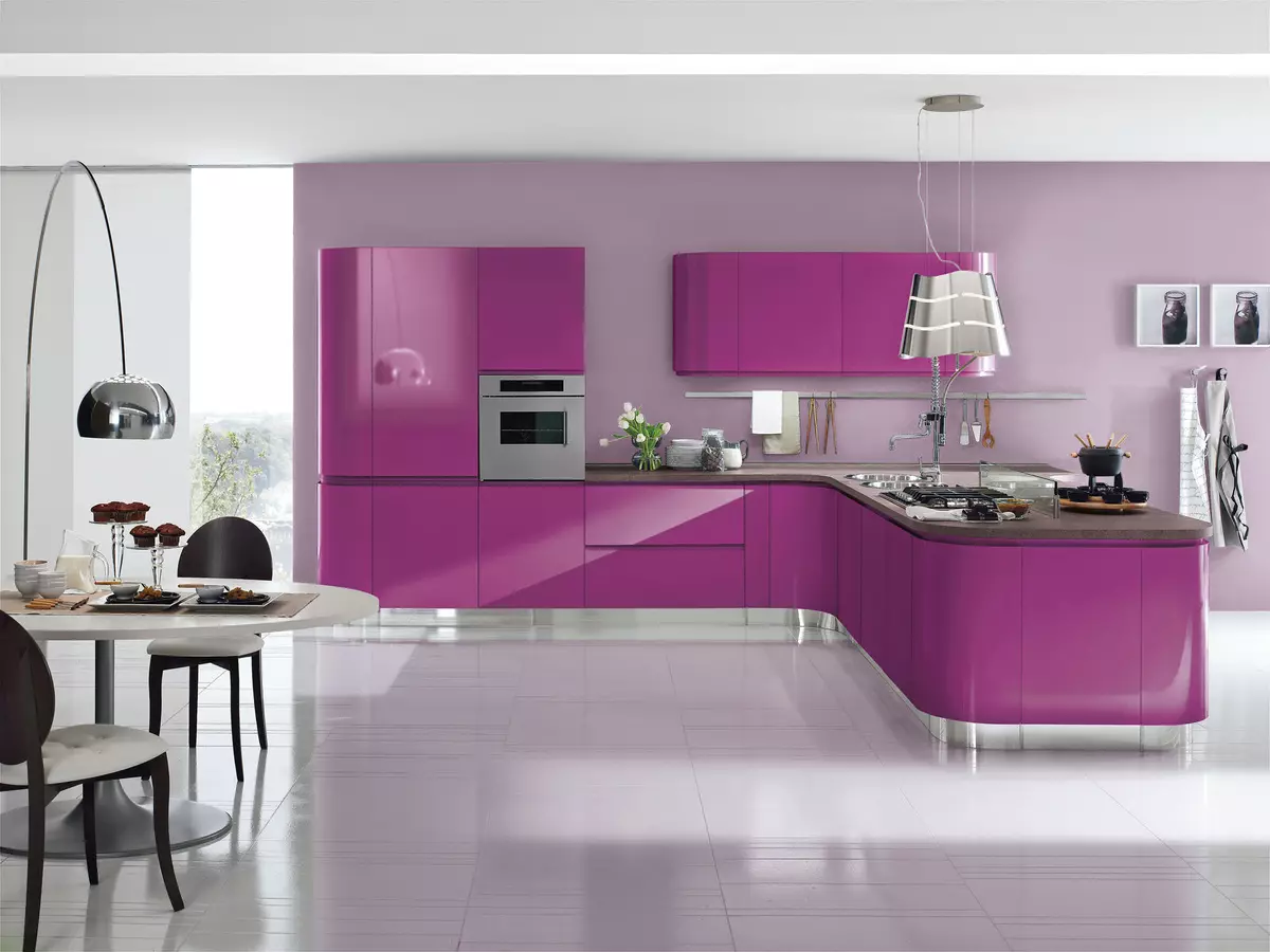
- For lilac kitchen You can make a bet on the contrast of white with fuchsia, burgundy-violet, as well as pink color. In addition, for this interior, you can purchase or order apron, made in the contrast of white and beige, gray and pink, white and silver, white and cold purple.
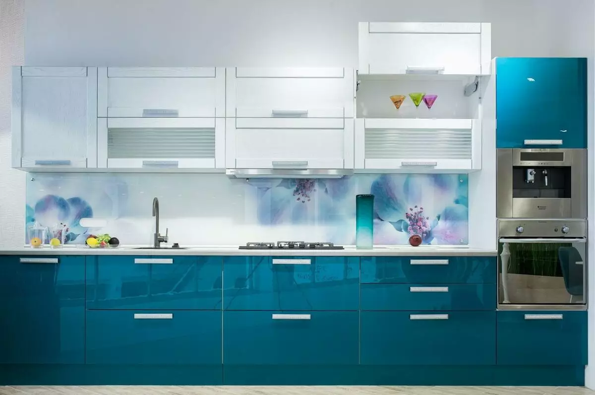
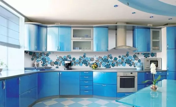
- In blue cuisine , diluted with white, background Apron can be gray-blue, white and blue, turquoise, sandy, beige, creamy, gray-beige.
For kitchens in dark colors
If some dark color is chosen as the basis of the color solution, usually the apron gets the role of a softening contrast perception. In this case, it is especially important that he looked well on a general background and was to the place.
- The most successful contrasts for the kitchen of gray will be duets with white. First, the white color always softens the perception of other paints, secondly, it allows you to decorate the apron by any pattern. Often there is a simple print in the kitchen interior and makes apron not only stylish, but also a spectacular accent. White here can be combined with fuchsia, lemon, green, orange.
- For brown cuisine, everything will depend on how dark color is used. If the wall either a kitchen headset, a dark accent of the room can be the apron. If it is light, preference is worth paying white, dairy, wood, gray-beige, gold, orange, transparent blue paints.
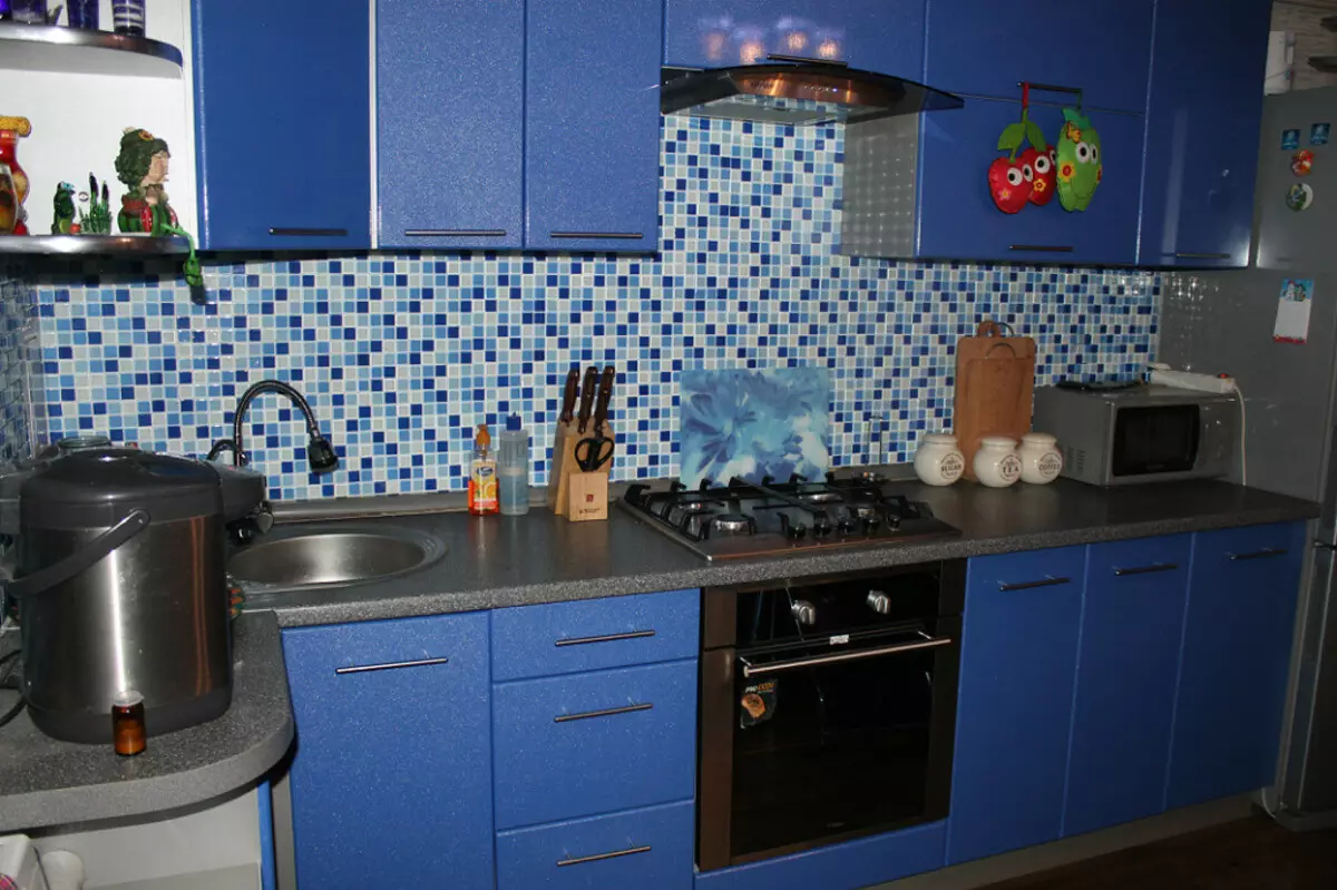
- For blue cuisine, you can choose an apron of white, sandy, dairy, coffee-colored. In addition, the contrasts of white with sand, gray, silver, blue and sandy-orange are welcome here.
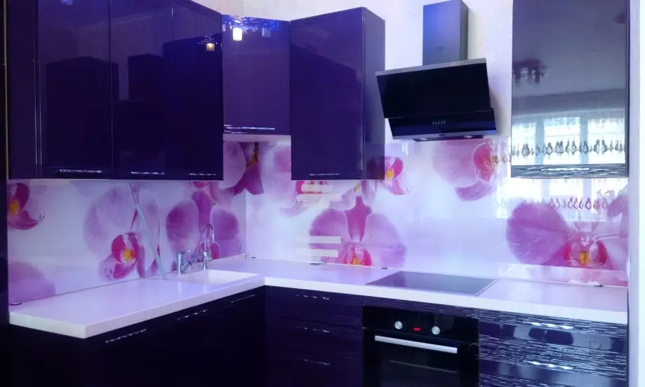
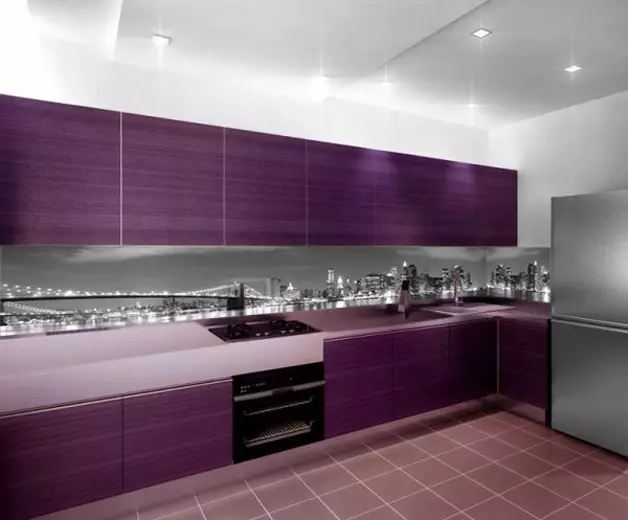
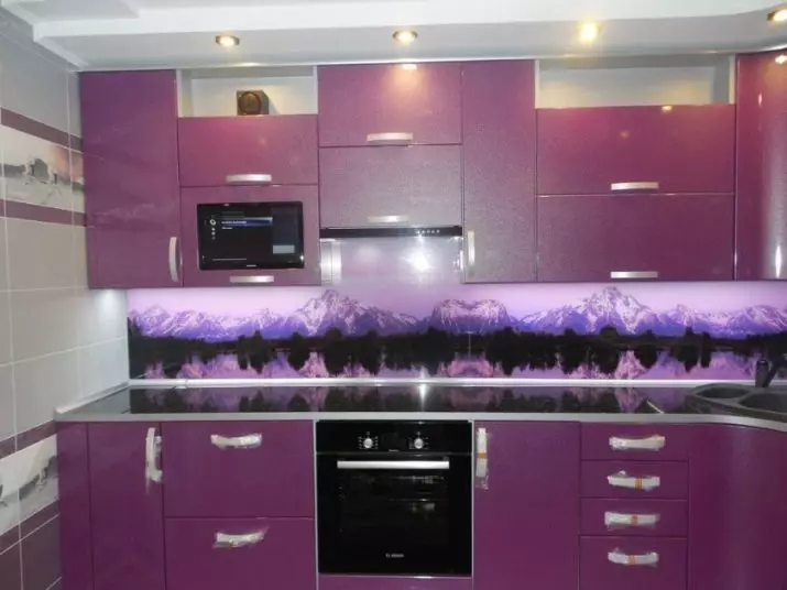
Purple cuisine can be decorated with a product made in white with a lilac or a silver pattern. Also here are appropriate tones that are suitable for lilac kitchens.
For bright
When the owners want a basic background of the kitchen any dynamic color, You have to select apron in brighter and muted tones.
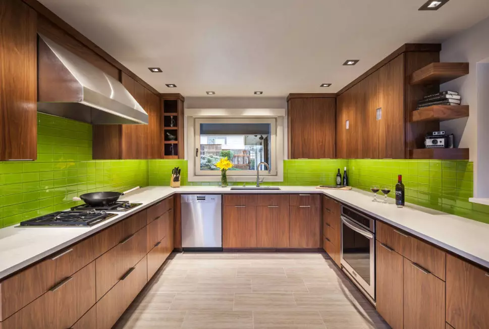
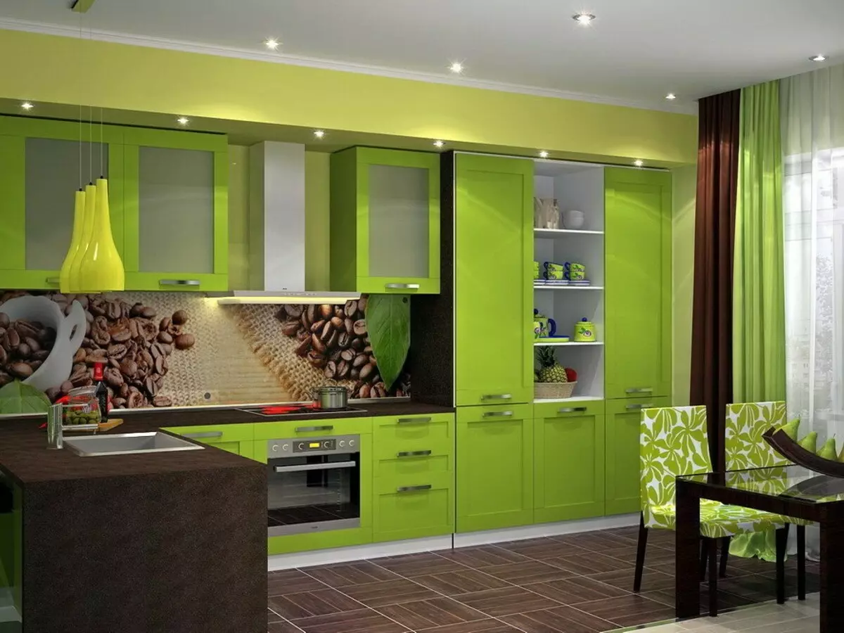
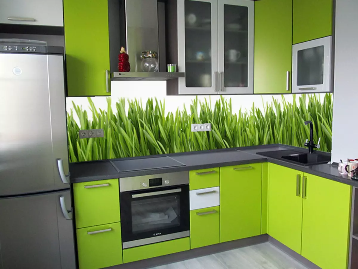
- For example, for the kitchen in green tones you can pick up the aprons of woody, white, beige color, as well as products in white contrasts with lemon, saturated green, watermelon, orange tones and black.
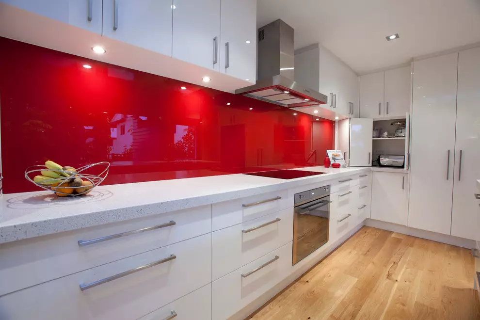
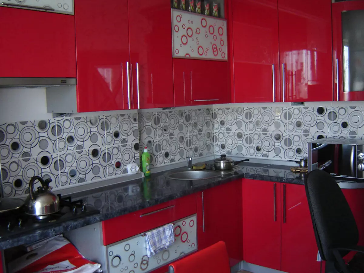
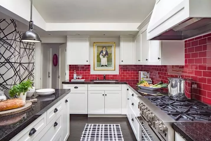
- For red or burgundy cuisine, aprons are suitable, made in white, white-gray, white-black contrasts. Also here is appropriate and white trio with wine and light gray.
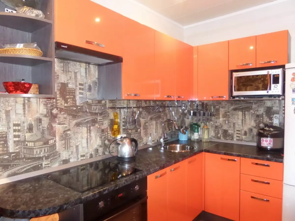
- The kitchen in orange tones is better supplemented by apron, the color combinations of which are represented by white duets with orange and salad, sandy, green, orange with black, white, terracotta. In addition, brown aprons look beautiful in such kitchens.
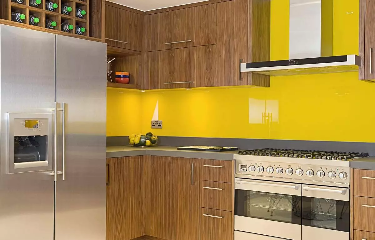
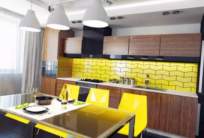
Yellow in the kitchen can be combined with gray, sandy and white suitable for Salad.
As for the aprons themselves, it is possible to turn to the opinions of specialists. For example, option:
- white color combines with any color contrast, including metered black;
- Green color looks best in the neutral interior;
- The red tone is perfectly composed with white and light gray;
- gray shade advantageously looks in pink and white kitchen;
- Beige is appropriate in a duet with brown, gold, silver;
- Lilac is perfectly combined with white and silver-gray.
Recommendations
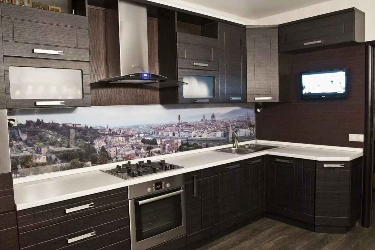
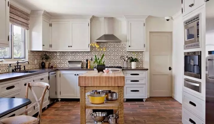
Selecting the color solution for kitchen apron, it is impossible to underestimate the resources of a specific stylist. It is no secret that each direction of design has its own priorities, the knowledge of which will allow you to pick up the shade of the apron most correctly. For example, For Loft Stylistics Ideal the use of brick and concrete shades . Modern is associated with warm solar paints: beige, sandy-orange, peach.
To find the best color for a specific headset, you can focus on both the color of the facades of the top or bottom and the color of the tabletops. In addition, the drawing can cross the color of the fittings and the texture of the material (for example, combined with trim under stone, marble, wood). Select the option to the classic direct or angular kitchen headset is needed to consider the degree of illumination of the room. Sometimes beautiful color in the space of a particular room looks not as I would like.
Choose a variant of combinations in color headset can be based on ready-made projects that are generously divided by Internet portals. Designers note that the neutral shade of the upper and lower cabinets of the kitchen requires shades that will be darker or lighter by several tones. If they are identical, then they will merge into a single color stain, which will deprive the interior of the multifaceous. At the same time, juicy tones need support.
If it is decided to decorate the kitchen apron of bright color, it needs to be supported by the fitting of a similar tone. It can be door handles, towels, tea set. It is necessary to remember that the fact that the color of the apron is more dynamic, the concise form of the headset and less decor. Ornaments and complex drawings are also appropriate in the finish of the apron if the headsets in the kitchen are designed in strict lines and restrained design.
Beautiful examples
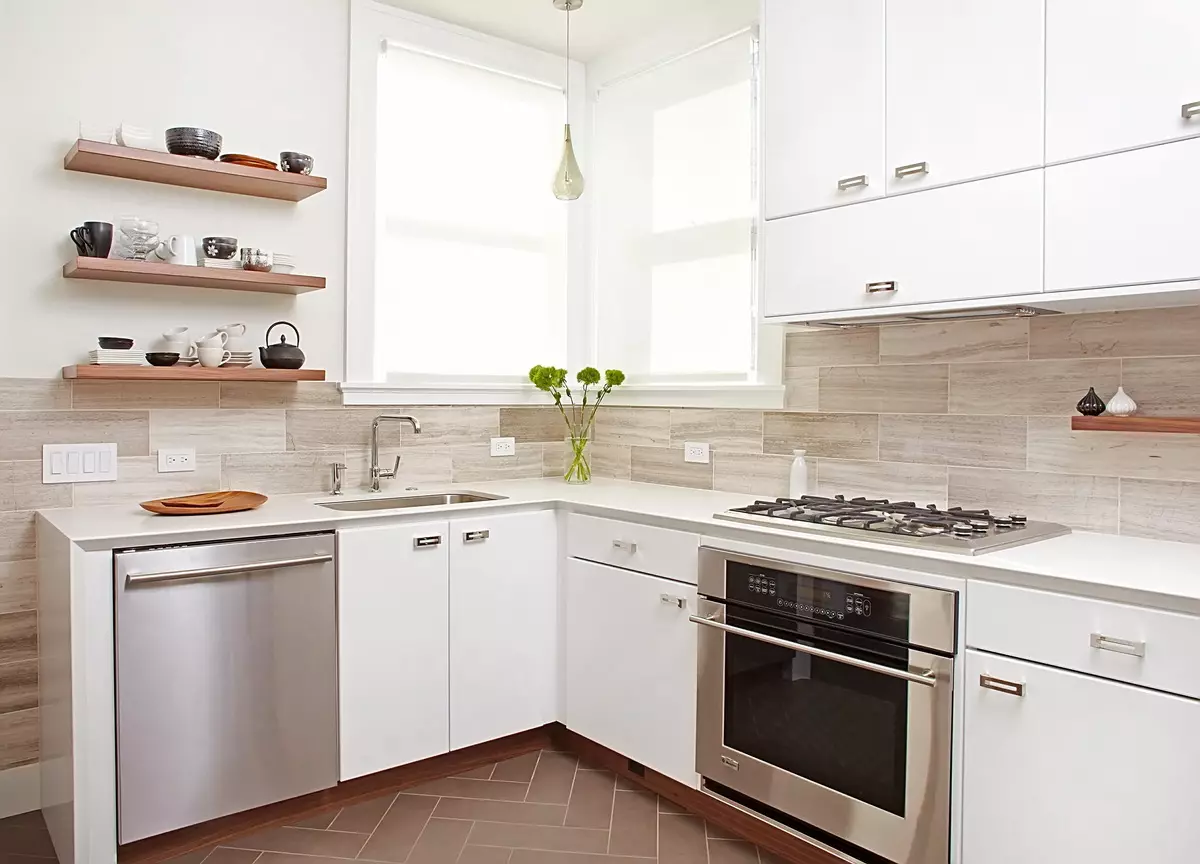
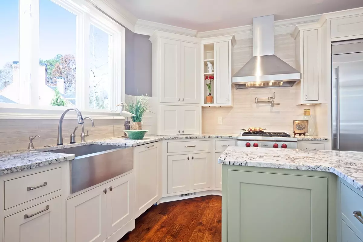
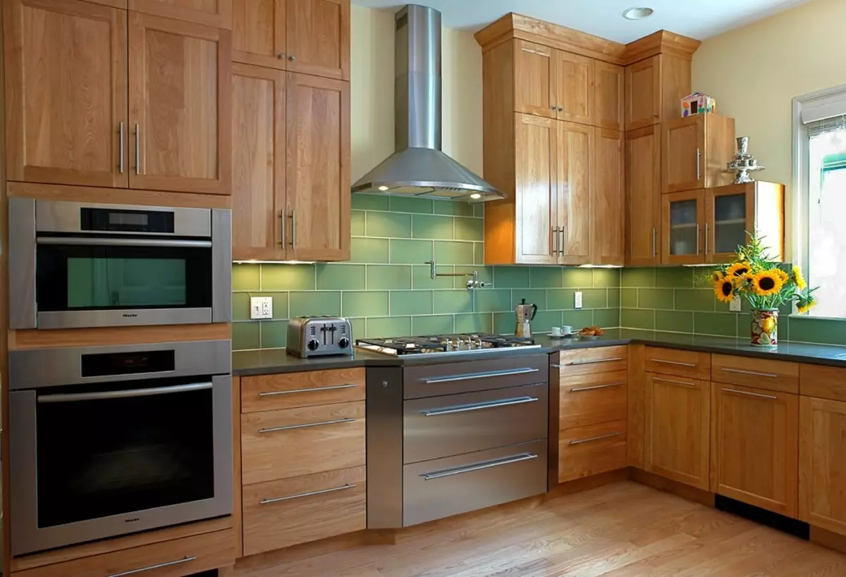
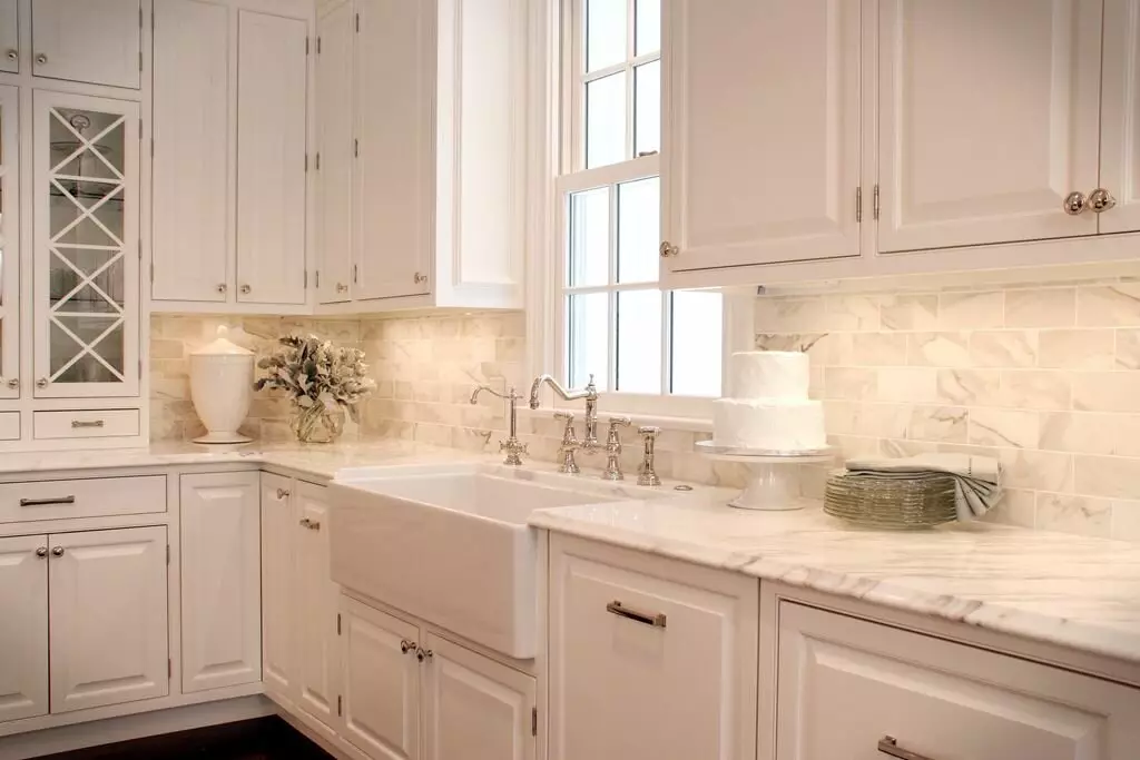
We offer 10 examples of a successful selection of shades of the apron, taking into account the background of the interior.
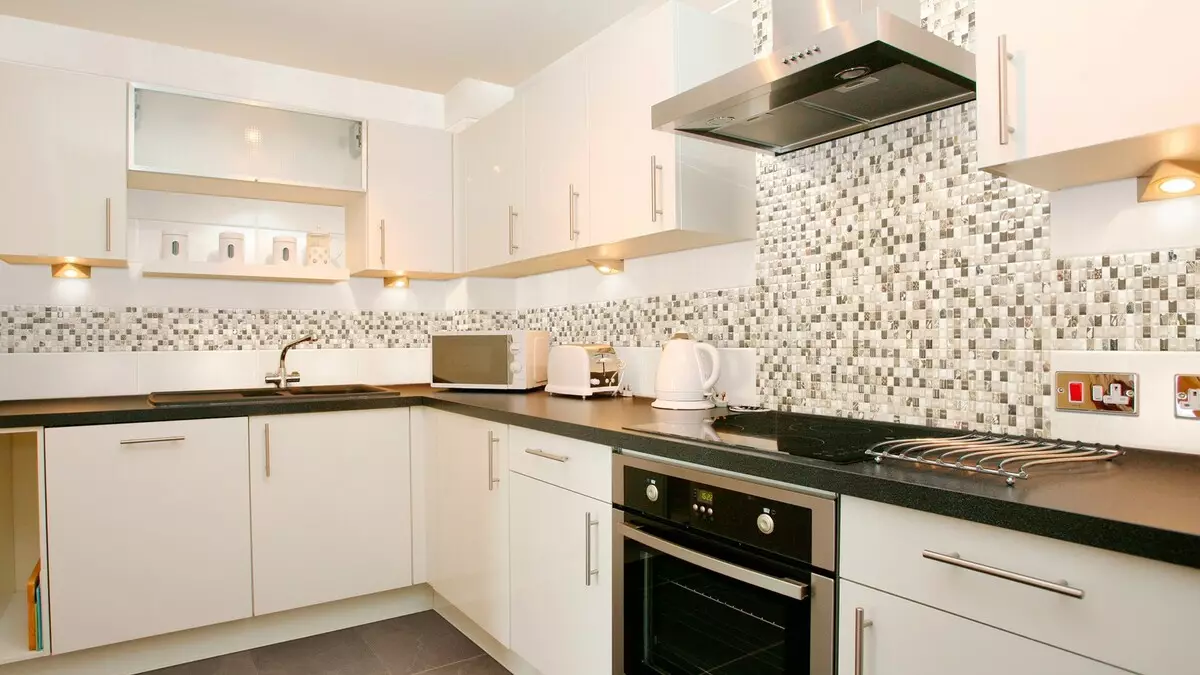
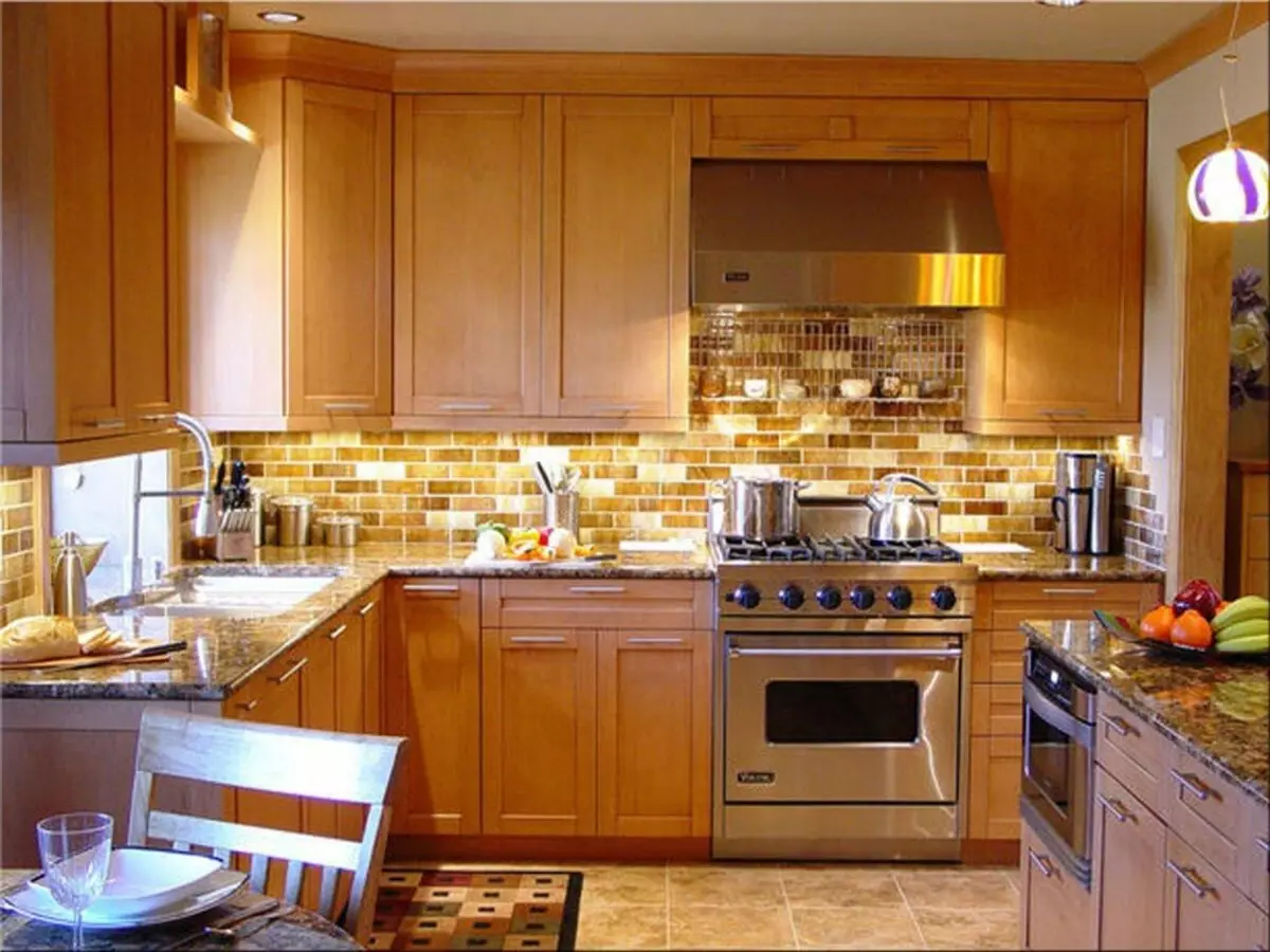
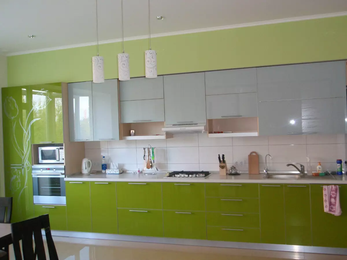
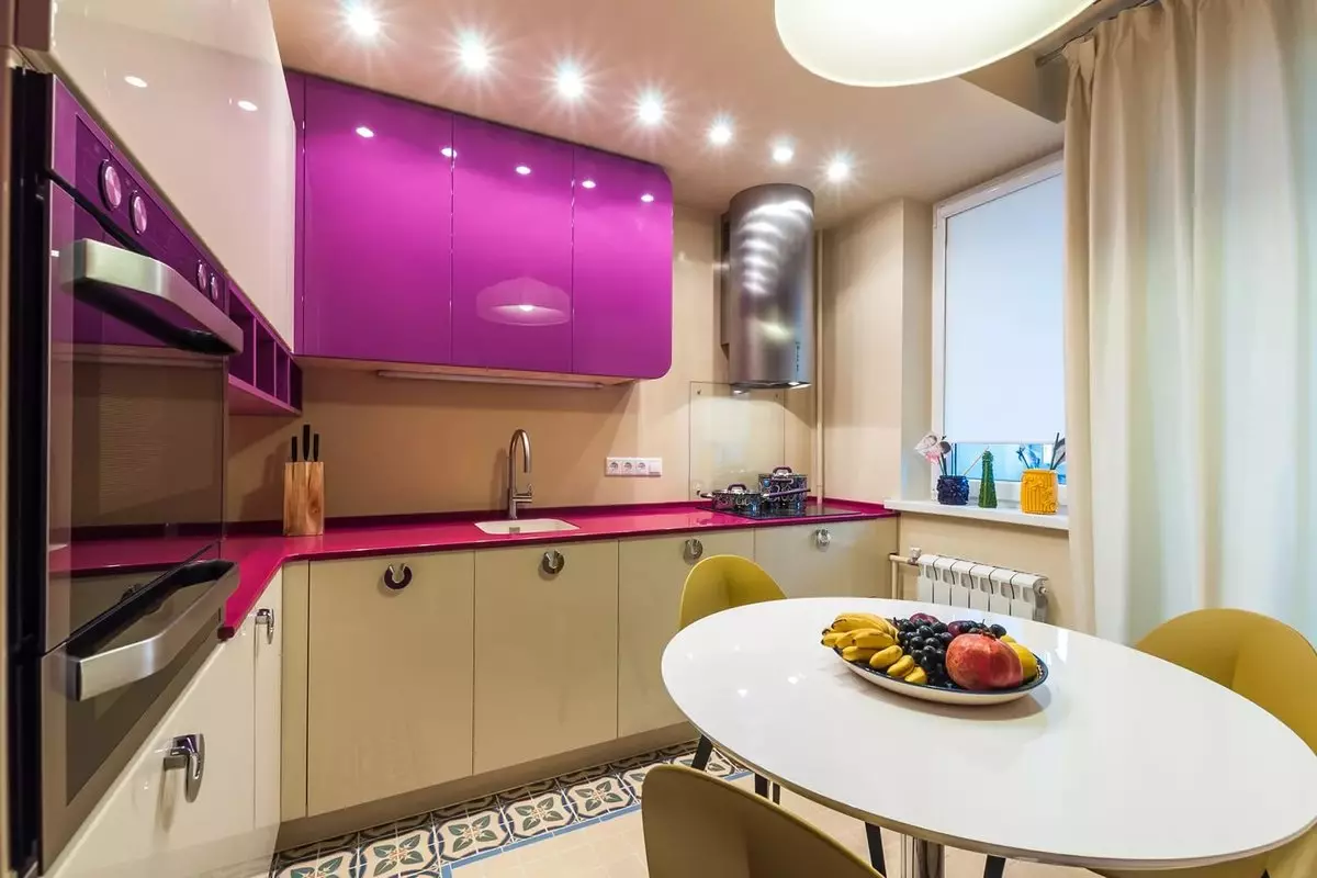
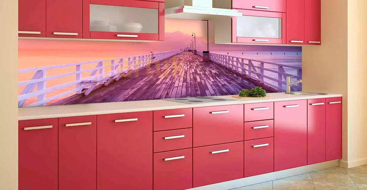
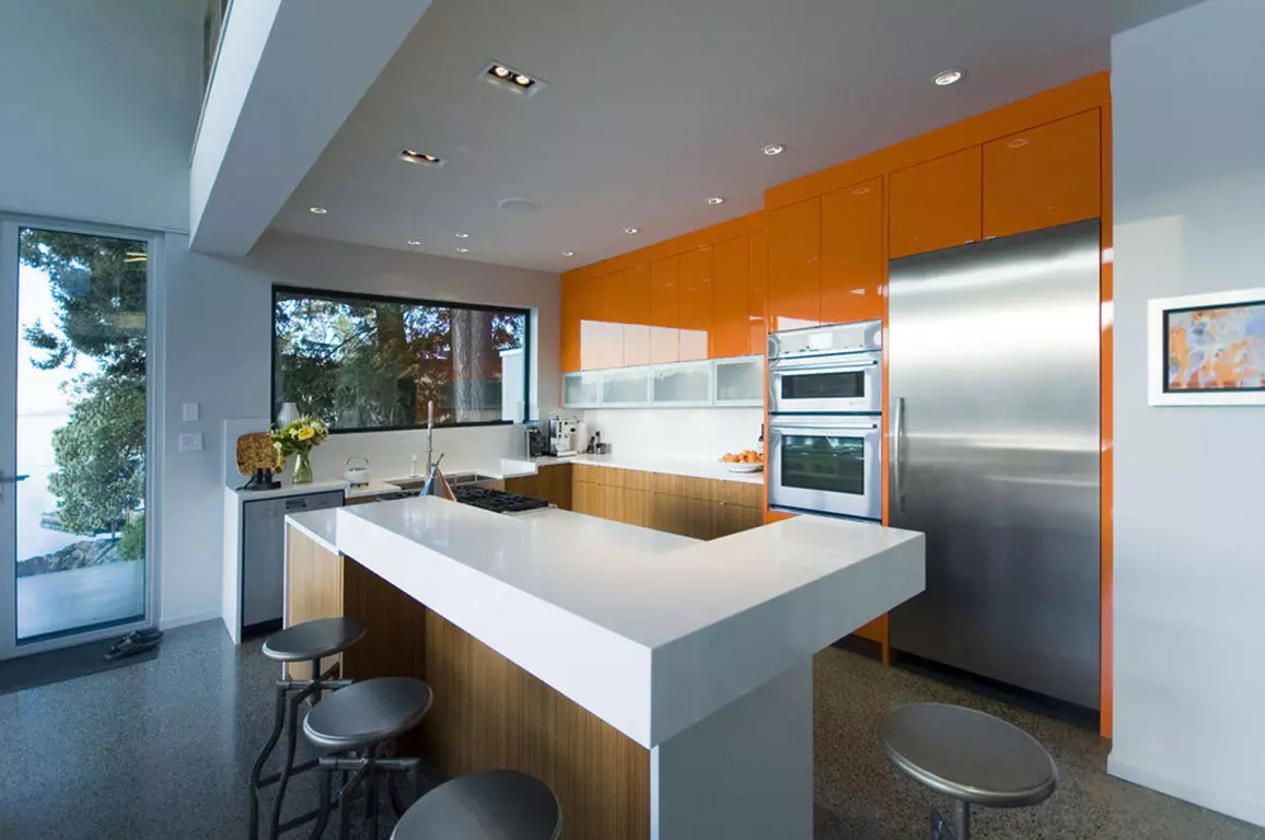
- Harmonious selection of apron for bright kitchen.
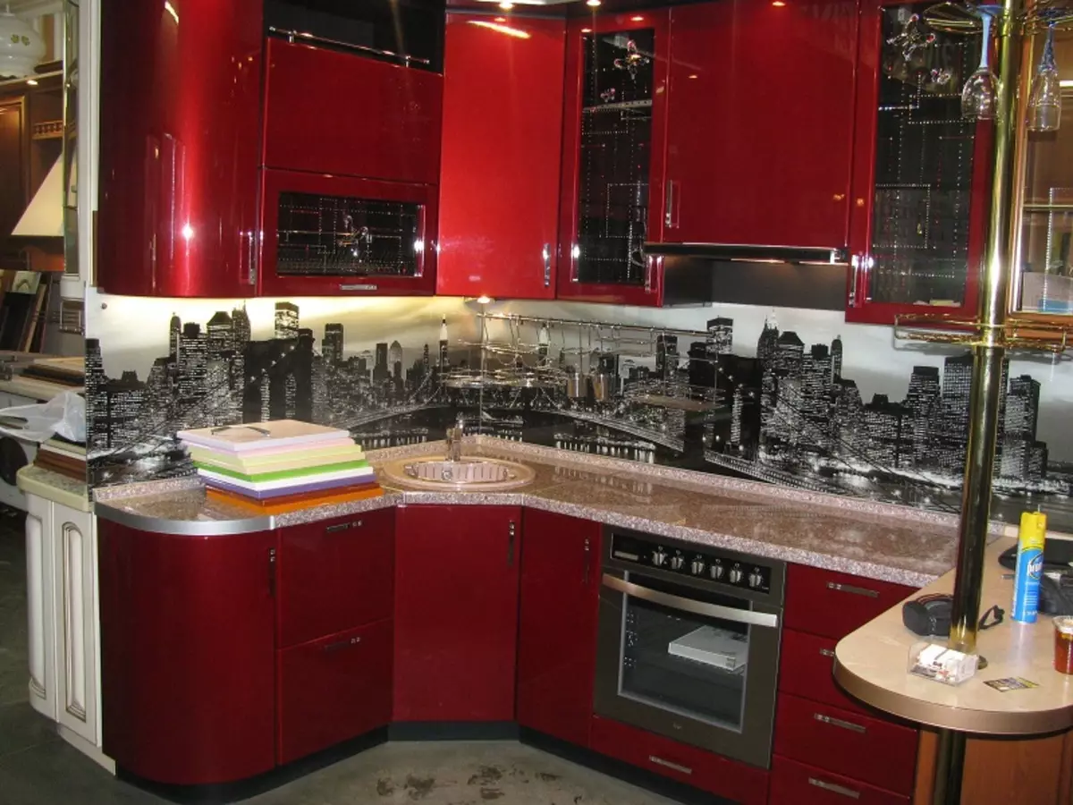
- The solution for the interior in bright colors.
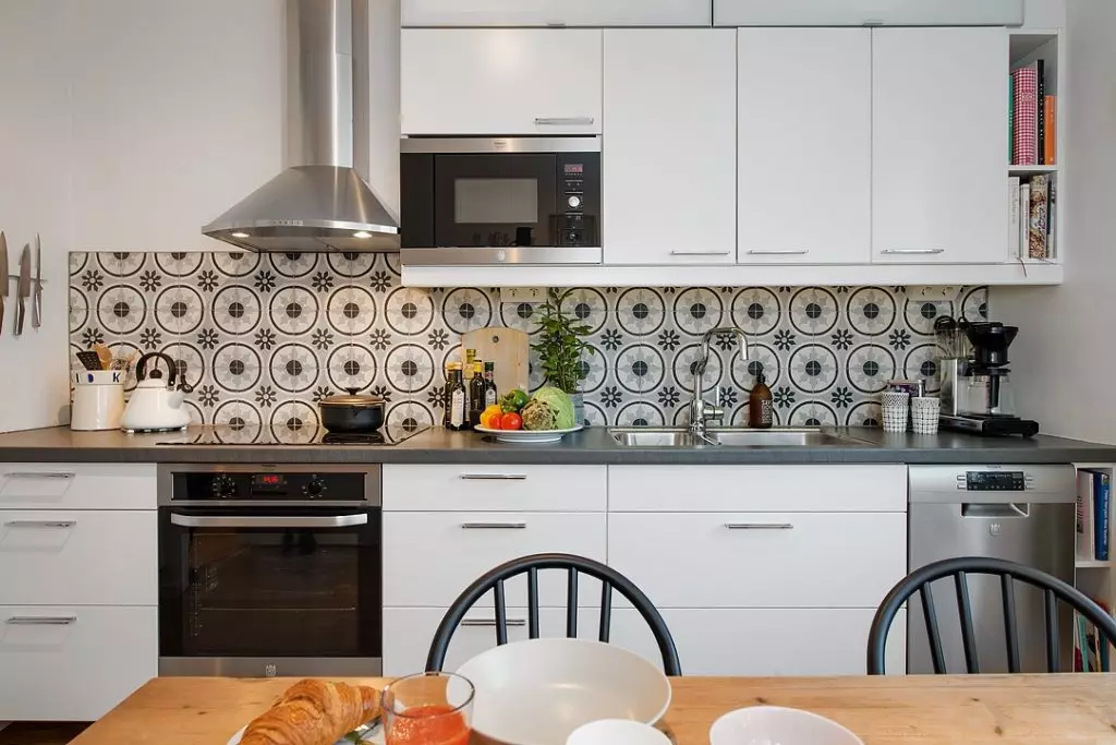
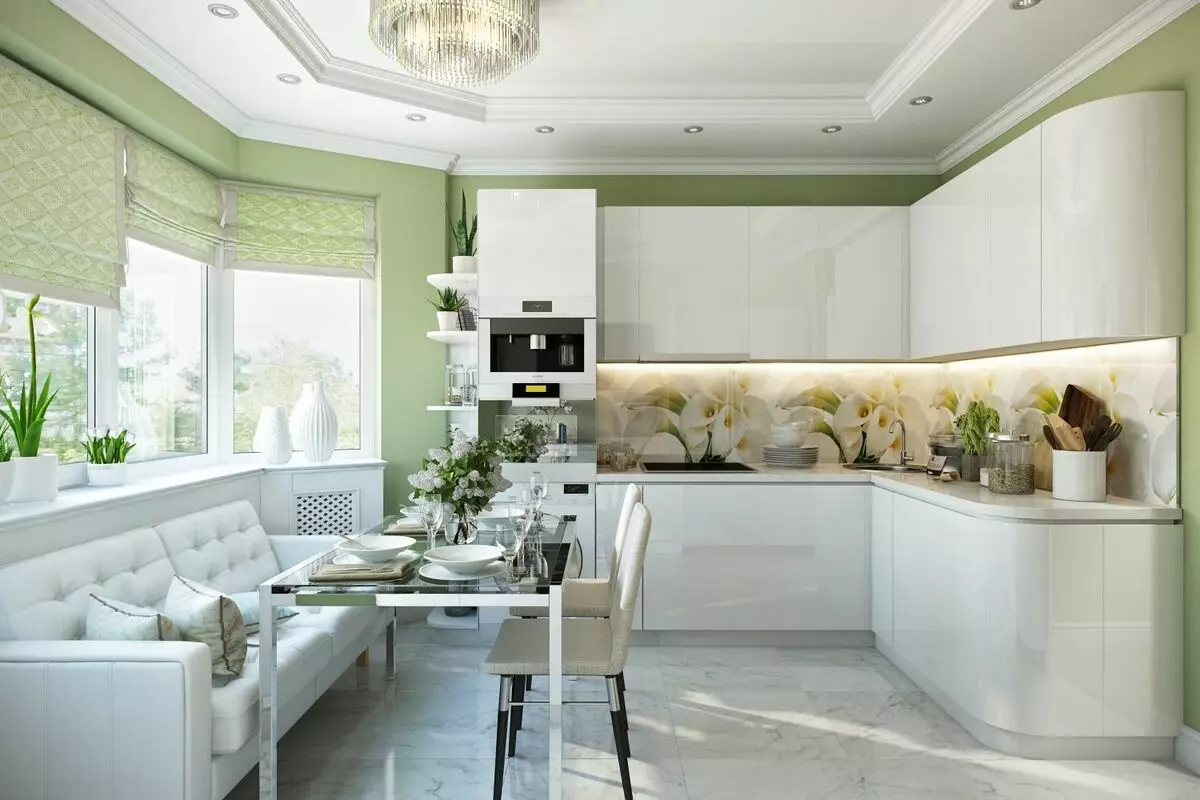
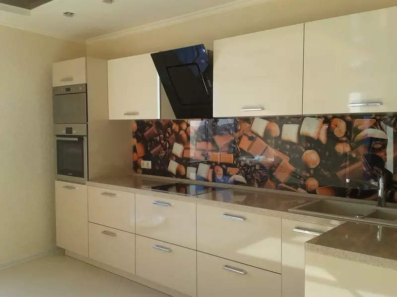
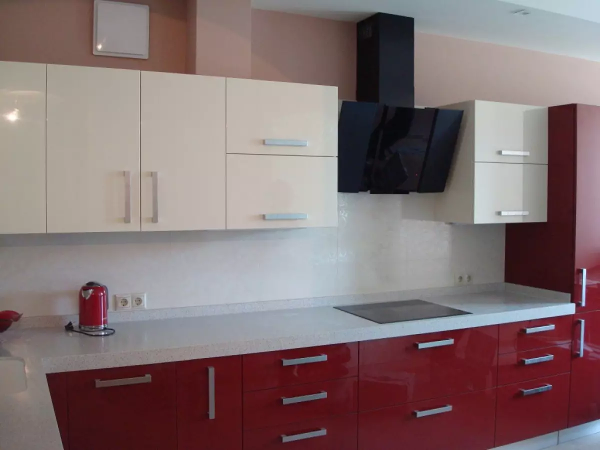
- Accenting space in neutral design.
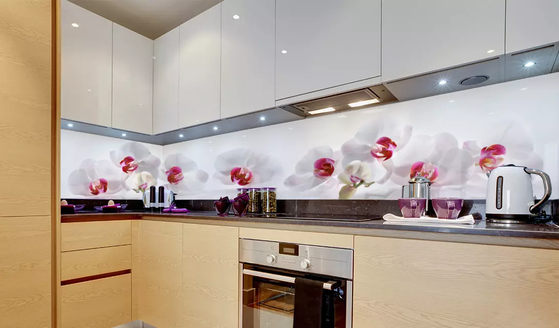
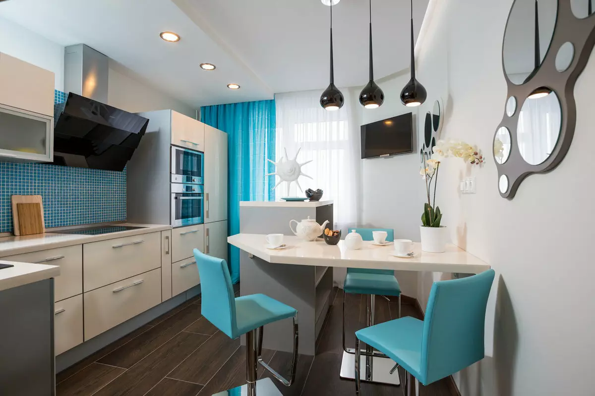
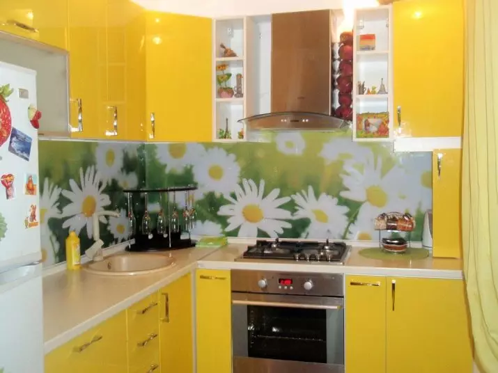
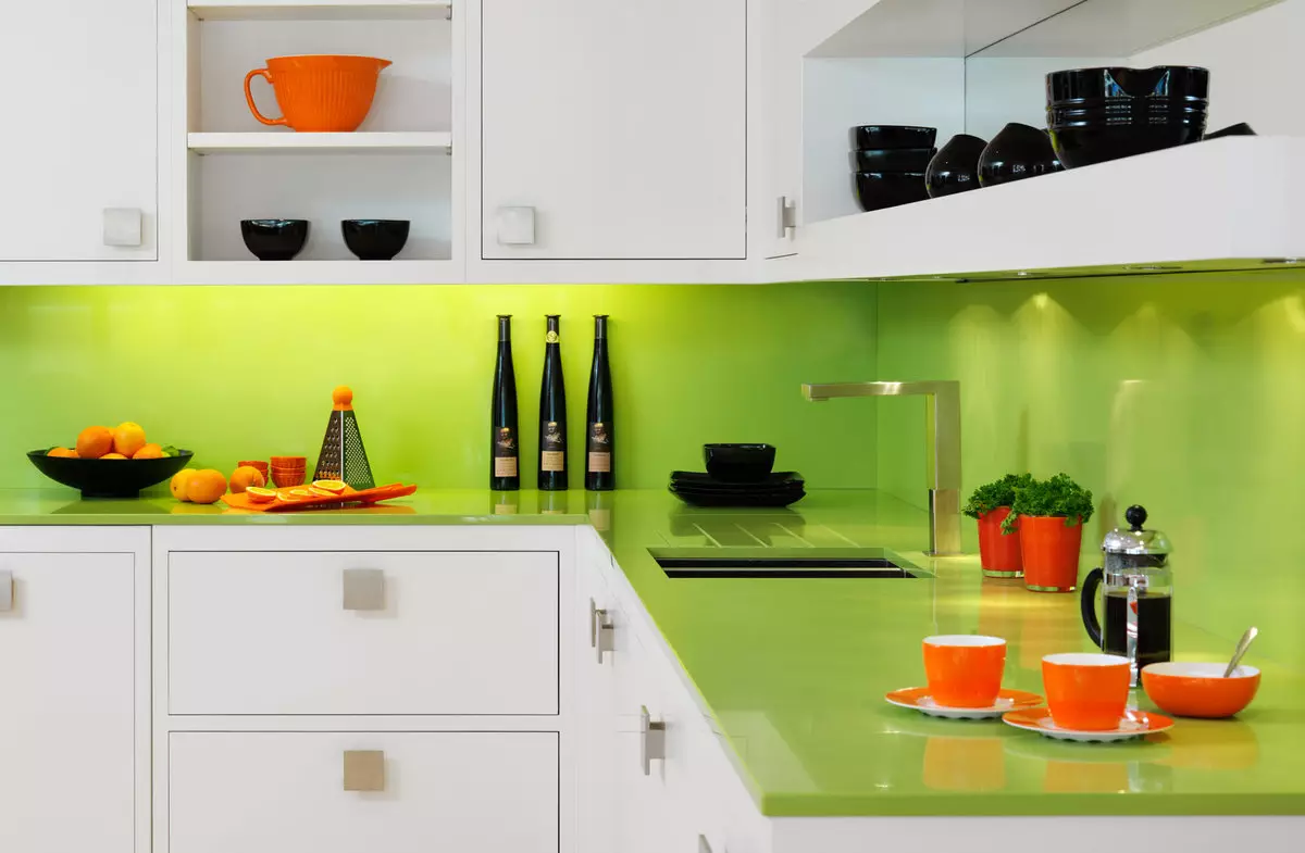
- Using bright color for kitchen arrangement.
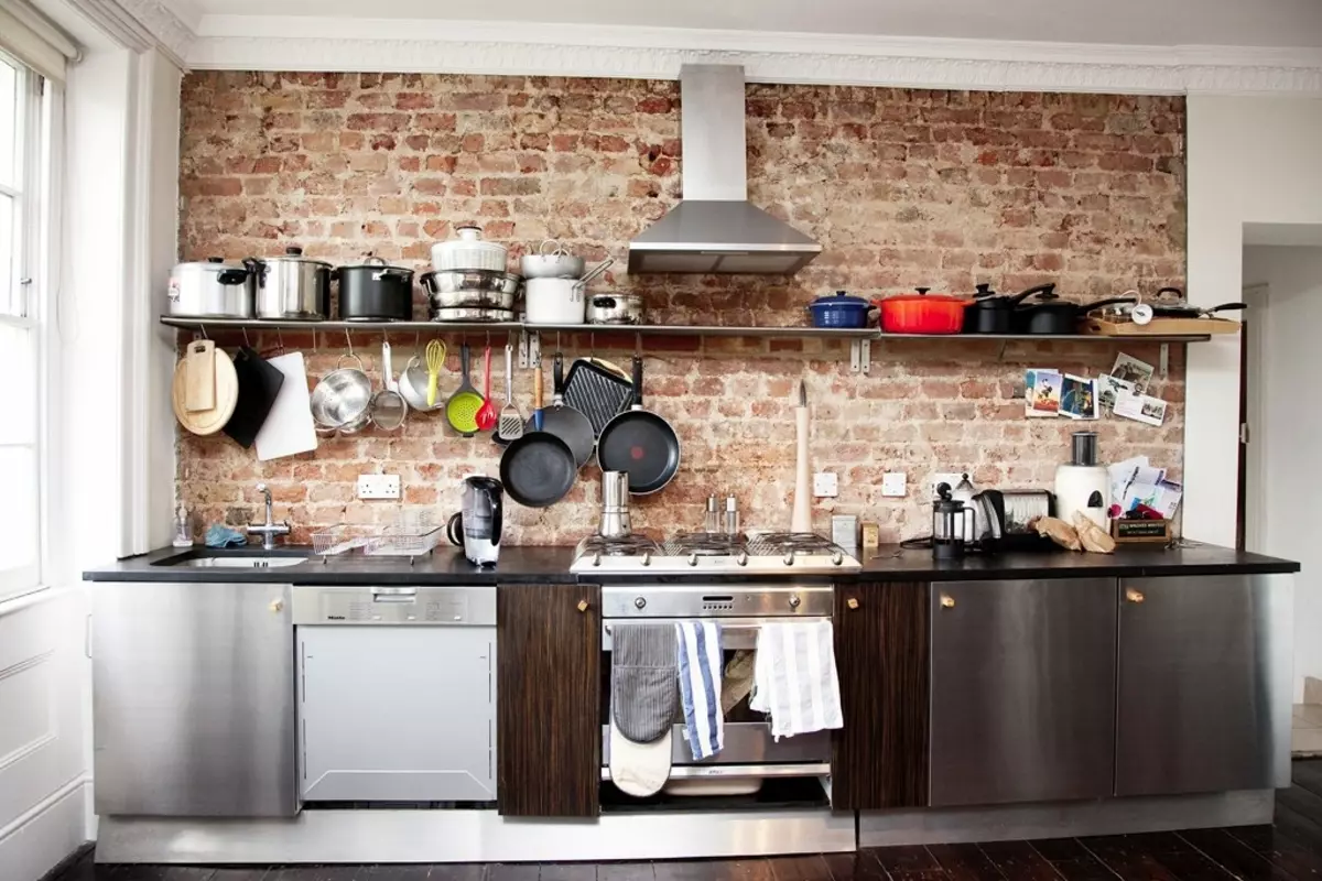
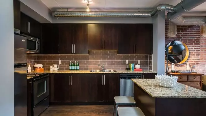
- The choice of apron for loft style.
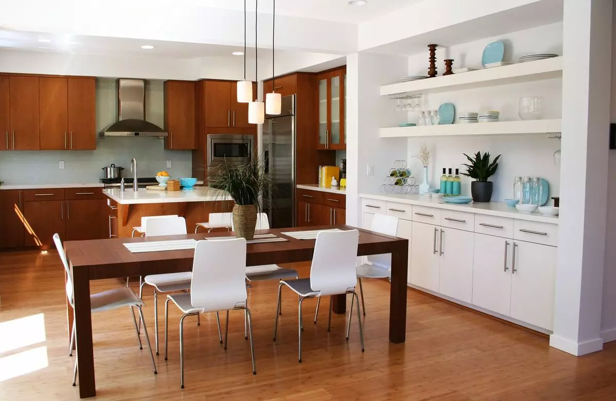
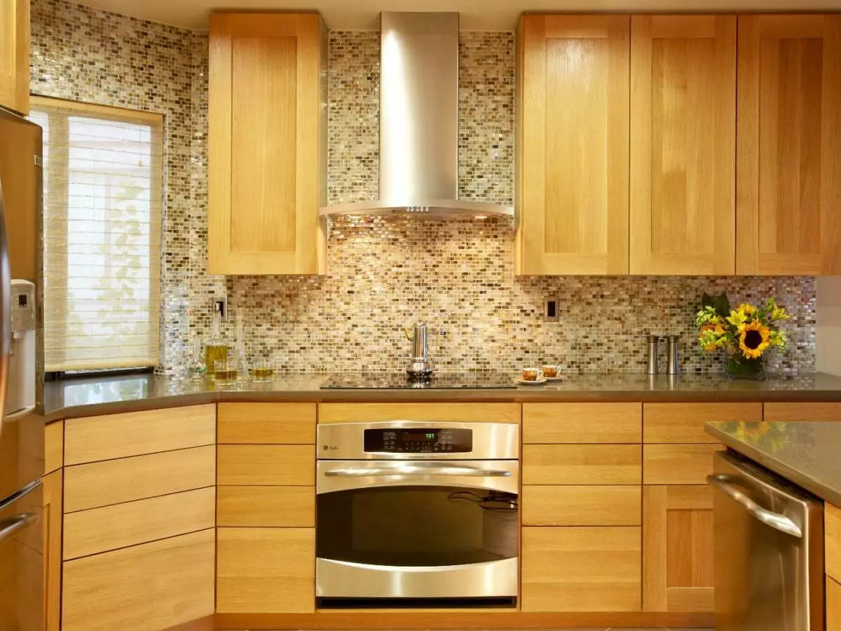
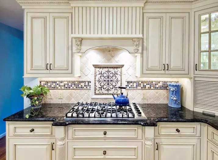
- Option of the working area in the classic style.
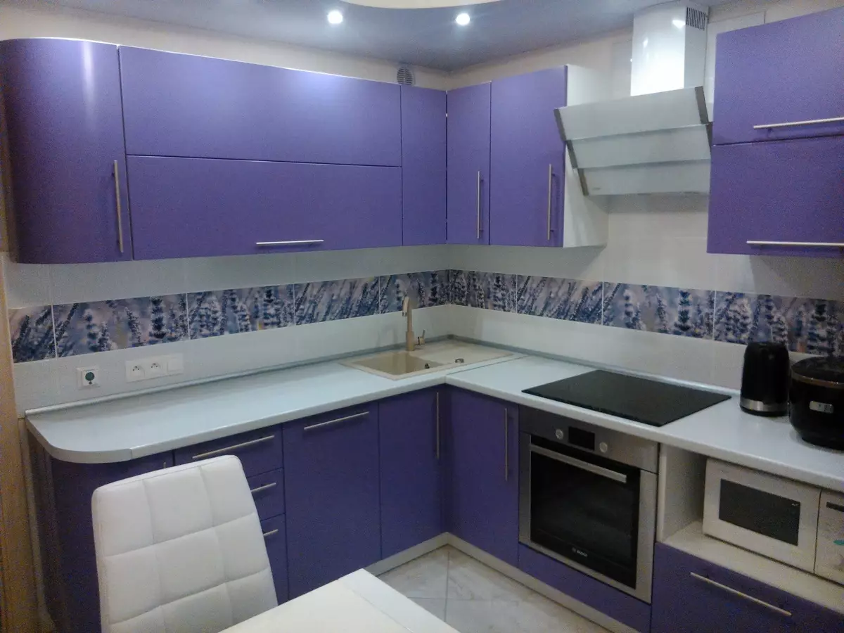
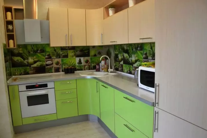
- Harmonious color combination of apron with facades headset.
- Selection of shade under the interior accessories.
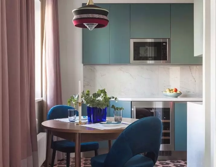
- Successful color duet Apron with kitchen furniture.
- An example of stylish coloring apron against the background of a neutral interior.
On how to choose a kitchen apron, look in the video below.